Nothing Phone (1): After using Nothing phone (1) for a week, it’s possible that this device is doing something. The device has weathered two weeks of intense gaming, nonstop calls, and streaming web material. The verdict is epic, in a word! The gadget that has been the subject of recent buzz appears to be worthwhile of both time and money.
Except for a few small drawbacks, Nothing definitely offers something worthwhile. Is it the upcoming major flagship killer, though? Since context is everything, the solution can be found in the specifics. The specifications are perfect, and the design is cutting edge for Android cellphones.
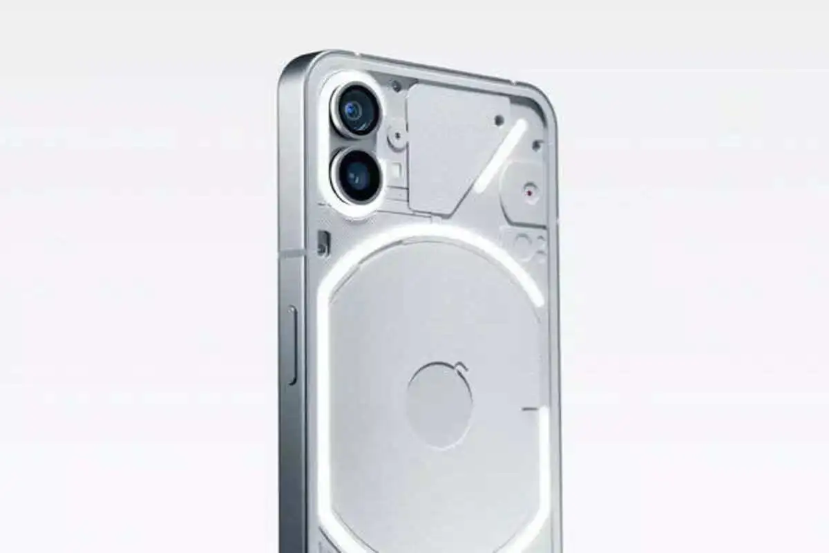
Nothing phone (1), to use a poetic term, particularly stands out from the group of Android smartphones in the mid-range. The bar has definitely been raised for design breakthroughs in smartphone technology because to the distinctive translucent design and Glyph interface.
The first smartphone from the London-based business sports a glass back and an iPhone-like metal frame, giving it a premium appearance. The smartphone’s excellent construction is one of its main selling points. The smartphone (1) feels wonderful in the hand and has a sleek appearance for a mid-range smartphone.
It has a futuristic appearance and reminds one of the Sony Xperia U from the early 2010s, which included a bottom illumination bar. Although many have been quick to point out the Nothing phone (1)’s (1) apparent resemblance to the iPhone 12 provides the gadget a distinctive look, the seamless merging of an innovative design and user interface.
Although less practical, the pulsating LEDs definitely live up to the expectations and make the item stand out. It is a robust phone since Gorilla Glass 5 Layers surround its aluminium frame. The smartphone’s attractive design is enhanced by the rounded metallic finishes.
After opening the box and using the Glyph for a while, the device gave off the immediate impression of being incredibly cool and practical. The instant one starts using the device, all concerns regarding the design’s viability vanish.
Also Read: Cryptocurrency Update: Know Latest Update About Cryptocurrencies
One billion color-capable 6.55″ OLED display is included with the Nothing phone (1). The display front of the smartphone lives up to expectations because the OLED panel provides vibrant, true-to-life visuals. Scrolling is effortless without the fluidity found on most flagships thanks to the adaptive 120Hz refresh. The longer battery life is a result of the adaptive refresh rate.
Even though Nothing OS is an acronym for Nothing Operating System, it hardly qualifies as one. The gadget comes pre-installed with Android 12 and the Nothing launcher. The Play Store and the standard Google Suite programmes are included. The major benefit is that it doesn’t have any bloatware, so users won’t have to put up with annoying adverts anymore. The widgets, dot-matrix design, and aesthetics set the Nothing OS apart even though it shares many characteristics with vanilla Android. On its first smartphone, the UK-based business has pledged three years of software updates.
One robust gadget is the Nothing phone. The smartphone effortlessly exudes a luxury vibe given the carefully considered design and construction. Minimal customization of the Glyph interface is one of the smartphone’s drawbacks. The charger for the smartphone is not included in the box. Although the firm may have justified it by supporting wireless charging, most Indian users would still be hesitant to spend additional money on wireless chargers given that they are already forking over more than Rs 30,000 for the phone. In the absence of a 3.5mm connector, more users will probably choose Bluetooth headsets.
Also Read – Stock Market Update Today: Today’s Top Gainers
Keep watching our YouTube Channel ‘DNP INDIA’. Also, please subscribe and follow us on FACEBOOK, INSTAGRAM, and TWITTER.


