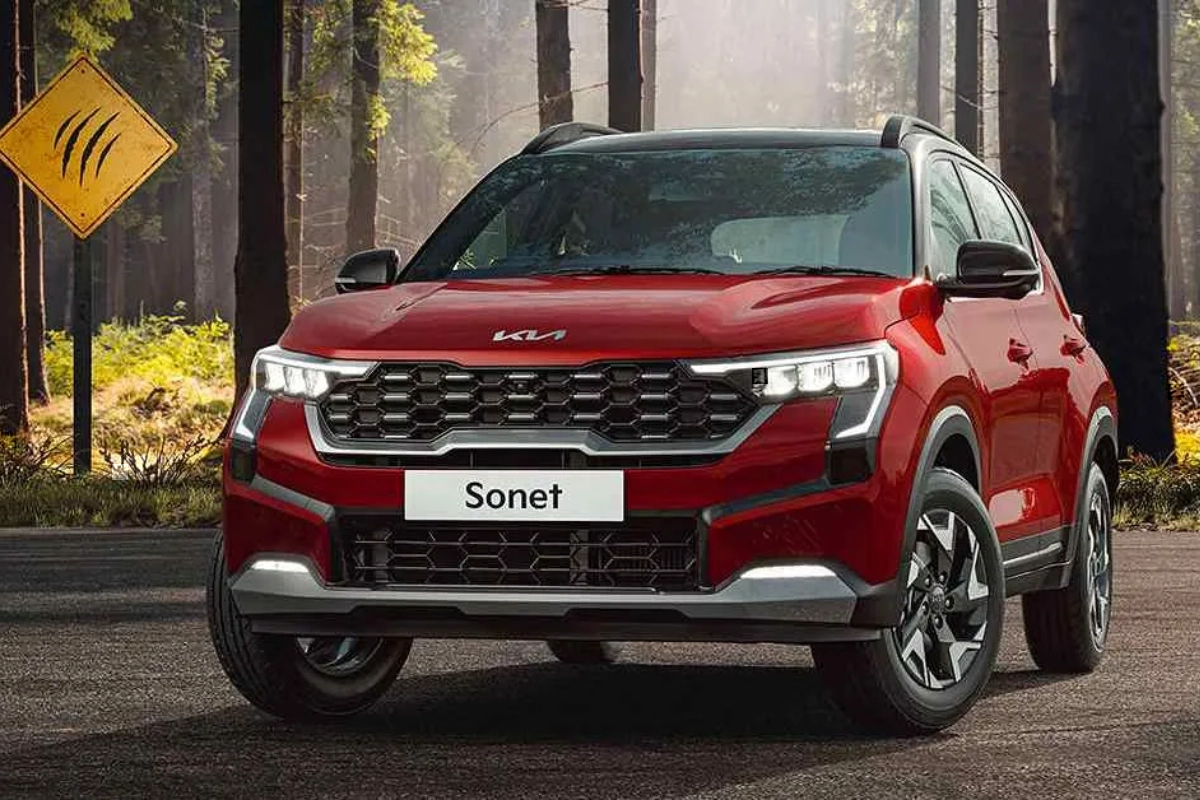
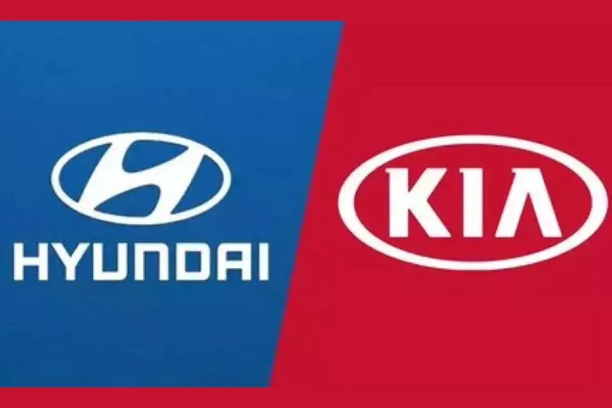
KIA: Car logos are among the most recognisable in the world, and every designer is aware of the value of brand identification. However, Google search data has shown that one particular automaker’s recent redesign may not be performing as well as it had been planned.
Also read: 2023 MG Hector: Disappointing but true! Only the ‘Sharp line’ to get the new looks
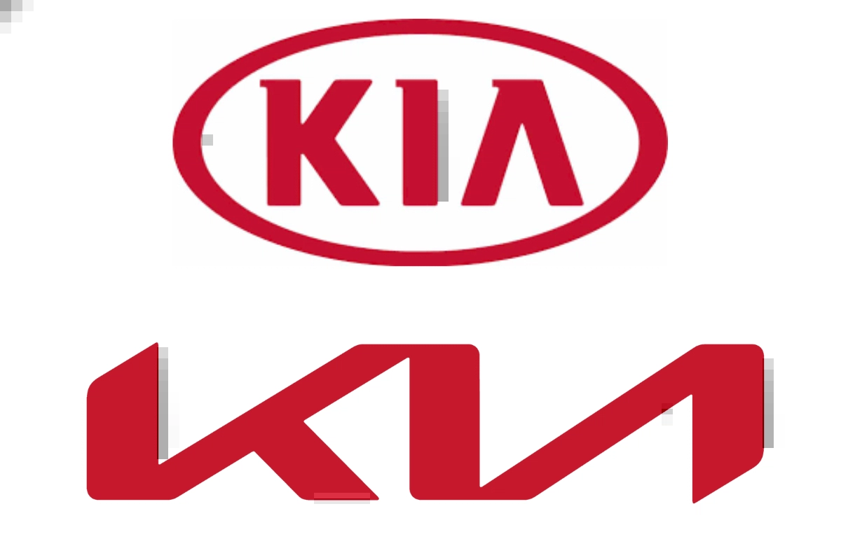
With great enthusiasm, Kia unveiled its new logo last year, ditching the somewhat cartoonish 3D typography for a flat design. But over two years later, it appears that readability is still a problem, and we have the hard statistics to back this up.
Where did KIA go wrong?
It was previously mentioned that drivers have been misled by the Kia rebrand for 2021, with many thinking it actually says KN rather than Kia. As of right now, 30,000 people every month are repeating the mistake, according to a Twitter user.
That many individuals search for “KN automobiles” on Google each month. The new logo was unveiled at the beginning of 2021. “KN” searches began as soon as the new logo became widely recognised. To be fair to Kia, we did enjoy the new logo when it first emerged, Of course, we identified it as the Kia emblem, but it’s obvious that many other drivers don’t.
Also read: Honda Cars to take on rivals with its upcoming cars, India launch details here
Keep watching our YouTube Channel ‘DNP INDIA’. Also, please subscribe and follow us on FACEBOOK, INSTAGRAM, and TWITTER.


