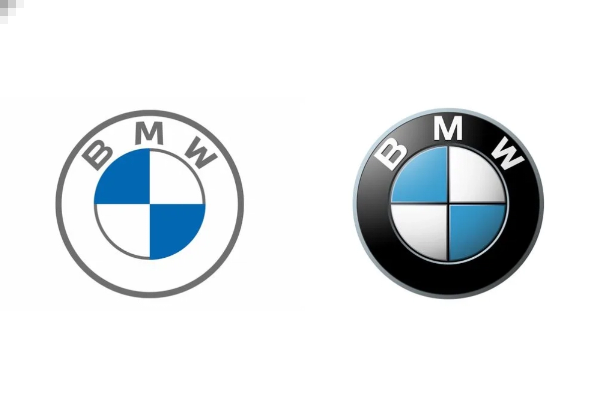
Car Logo: Several automakers have chosen in recent years to streamline their emblems into more understated forms. Automobile manufacturers including VW, Audi, Citroen, Nissan, Peugeot, MINI, Toyota, Dacia, Renault, Volvo, Kia, Rolls-Royce, Ford, MG, and Vauxhall have all chosen to flatten their emblems as opposed to sticking with the chrome-style and metallic badges that were popular in the early 2000s. A trend known as skeuomorphism is that logos on all platforms are starting to lose their three-dimensional elements and textures. But why is this change suddenly happening? Read on to know.
Why are car makers shifting to simpler logos?
A logo that works well across several platforms is becoming more and more important as more automakers start to market and sell their products through apps and websites. In the current market, intricate the intricate details and three-dimensional views are being phased out of logos since they have to work on a digital screen before anything else.
A more complicated image loses its distinguishable qualities, yet a simple flat image made up of only important shapes and lines can be shrunk to the size of a small icon in the corner of your screen and still be recognised.
Practicality and functionality have ultimately been the primary drivers of most of the development, though trends and aesthetics have also had an impact.
Minimalism taking over
Not only is the auto sector seeing a move away from skeuomorphism, but this trend is seen in almost every area where a logo is used. Whether you like it or not, minimalism is sweeping the board.
Keep watching our YouTube Channel ‘DNP INDIA’. Also, please subscribe and follow us on FACEBOOK, INSTAGRAM, and TWITTER


