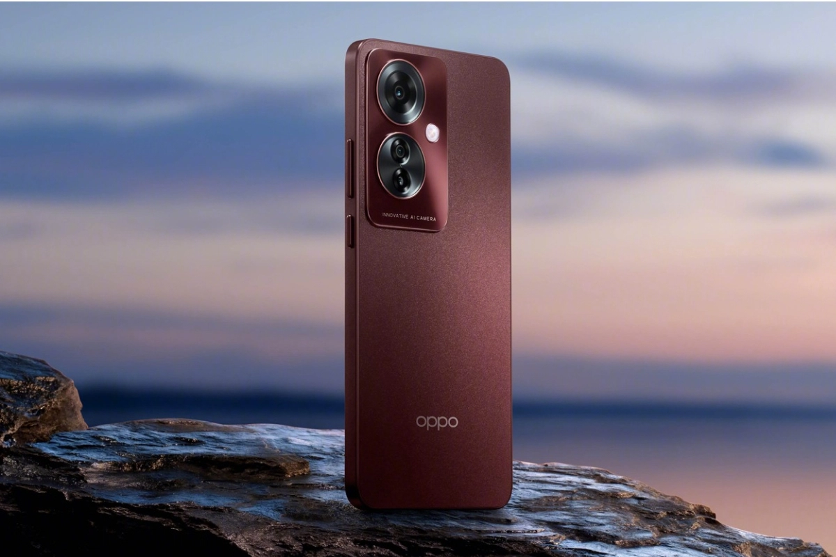
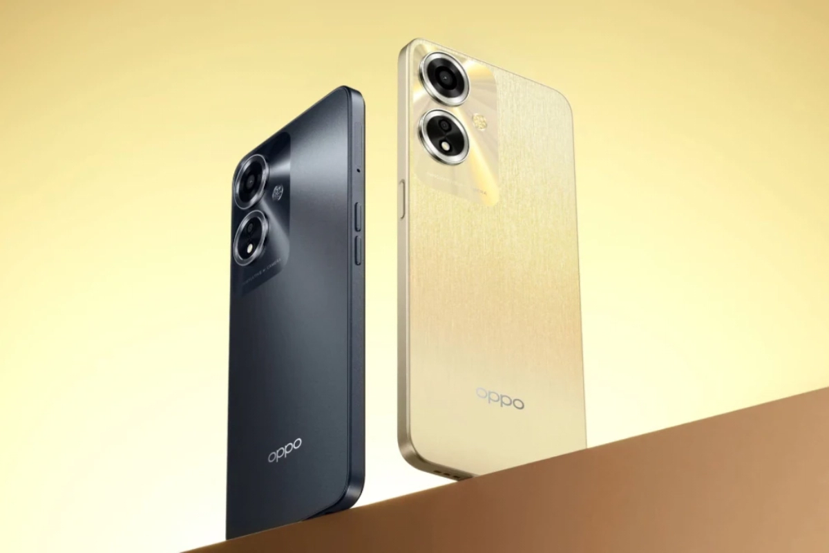
Oppo: The popular green colour of Chinese smartphone manufacturer Oppo‘s logo has lately been dropped. The corporation will reportedly begin employing black accents moving forward, according to reports. The alterations Oppo made to its profile photographs on Weibo were picked up on by some Chinese internet users. The business responded that green will continue to be a significant part of the brand when a fan questioned it about the Oppo Logo’s new colour.
Looking ahead, the Oppo emblem will gradually change to a monochromatic design.
Oppo’s new logo
By choosing a more understated and discreet approach to its visual identity, the organisation is indicating a trend towards minimalism. The once-prominent green squircle has been replaced, as is clear from their website, and the entire thing has been redesigned.
It should be noted that over time, Oppo‘s marketing materials have already started to lose the green logo.
The brand’s visual identity underwent an interesting change with Oppo‘s choice to use black accents and a monochromatic logo, keeping customers interested in the company’s upcoming designs.
Keep watching our YouTube Channel ‘DNP INDIA’. Also, please subscribe and follow us on FACEBOOK, INSTAGRAM, and TWITTER


